On roads that cross lava fields, glacial outwash plains, and windswept coastal stretches, Iceland’s road signs act as silent guides. They instruct, advise, and sometimes warn, serving both motorists and pedestrians. The history and design of these signs quietly reveal much about how this island nation approaches both modernity and tradition.
Nordic influences and Icelandic identity
Despite never ratifying the Vienna Convention that standardises road signs across much of Europe, Iceland’s signs will look familiar to travellers from Nordic countries. The designs draw directly from Danish and especially Swedish style, with their use of rounded corners and clear colour distinctions. But Iceland has developed its own signature too, with differences in the silhouettes illustrating usage and local language on every sign.
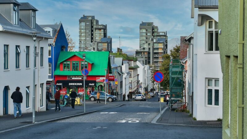
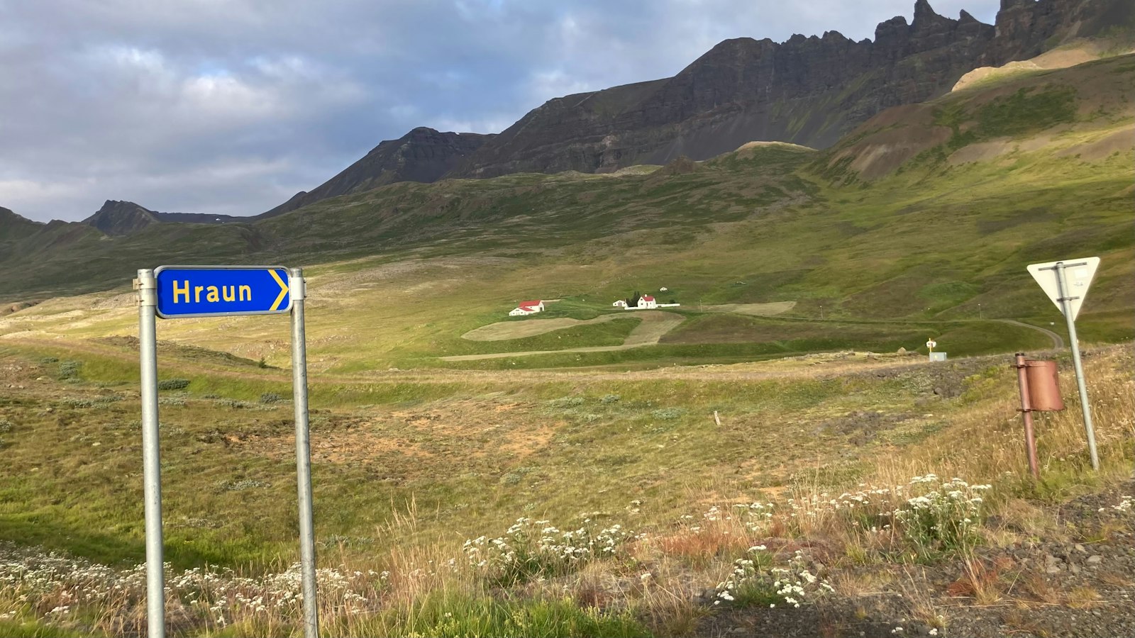
Shape and background colour indicate the purpose of each sign, a system seen throughout Europe. Warning signs, prohibitions, mandates, directions, and services are all marked by their distinct hues and forms, with backgrounds often a bright yellow to enhance visibility. Directional signs in Reykjavík and the neighbouring Capital Region break from this tradition, using a crisp blue-on-white palette, while signs elsewhere in the country are typically black on yellow.
Language, typeface, and practical adaptations
All main and additional text on Icelandic road signs appears solely in the Icelandic language, with very rare exceptions. This makes a drive across Iceland a lesson not just in geography but in encountering the linguistic heritage of the island, including letters unique to Icelandic such as þ (thorn), ð (eth), and æ. The typeface is a version of the British Transport font, specially adapted for these distinctive characters and accents.
With less traffic on most rural roads, Iceland uses far fewer signs in some areas than would be expected elsewhere in Europe. This minimalist approach can make the landscape feel even more open. However, a practical challenge arises after dark: most Icelandic road signs are not retroreflective, so they can be difficult to see at night, especially outside well-lit urban centres.
Distances and measurements on the signs are always shown in metric units. Over the years, road signage in Iceland has evolved; historic examples from 1939, 1956, and changes introduced in 1968 reveal more about the changing needs and visual culture of the 20th century.